仿饿了么加入购物车旋转控件 - 自带闪转腾挪动画 的按钮
一个仿饿了么 带伸缩位移旋转动画的购物车按钮
注意,本控件非继承自ViewGroup,而是纯自定义 View,实现的仿饿了么加入购物车控件,自带闪转腾挪动画的按钮。
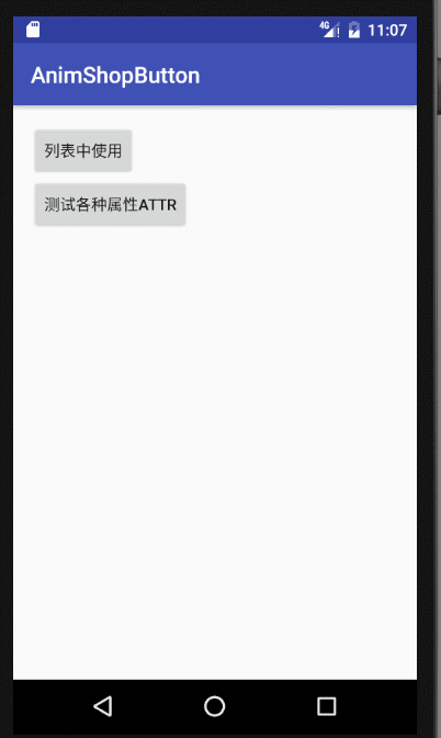
图 1 项目中使用的效果,考虑到了View的回收复用,
并且可以看到在RecyclerView中使用,切换LayoutManager也是没有问题的,

图 2 Demo 效果,测试各种属性值
Article
相关博文:
http://blog.csdn.net/zxt0601/article/details/54235736
https://gold.xitu.io/post/587220b9a22b9d005892422a
Import
Step 1. Add the JitPack repository to your build file
Step 1. 在项目根 build.gradle 文件中增加 JitPack 仓库依赖。
    allprojects {
        repositories {
            ...
            maven { url "https://jitpack.io" }
        }
    }
Step 2. Add the dependency
    dependencies {
            compile 'com.github.mcxtzhang:AnimShopButton:V1.0.0'
    }
Usage
xml:
    <!--使用默认 UI 属性-->
    <com.mcxtzhang.lib.AnimShopButton
        android:id="@+id/btn1"
        android:layout_width="wrap_content"
        android:layout_height="wrap_content"
        app:maxCount="3"/>
    <!--设置了两圆间距-->
    <com.mcxtzhang.lib.AnimShopButton
        android:id="@+id/btn2"
        android:layout_width="wrap_content"
        android:layout_height="wrap_content"
        app:count="3"
        app:gapBetweenCircle="90dp"
        app:maxCount="99"/>
    <!--仿饿了么-->
    <com.mcxtzhang.lib.AnimShopButton
        android:id="@+id/btnEle"
        android:layout_width="wrap_content"
        android:layout_height="wrap_content"
        app:addEnableBgColor="#3190E8"
        app:addEnableFgColor="#ffffff"
        app:hintBgColor="#3190E8"
        app:hintBgRoundValue="15dp"
        app:hintFgColor="#ffffff"
        app:maxCount="99"/>
注意: 加减点击后,具体的操作,要根据业务的不同来编写了,设计到实际的购物车可能还有写数据库操作,或者请求接口等,要操作成功后才执行动画、或者修改 count,这一块代码每个人写法可能不同。
使用时,可以重写onDelClick()和onAddClick()方法,并在合适的时机回调onCountAddSuccess()和onCountDelSuccess()以执行动画。
效果图如图 2.
Attributes
| name | format | description | 中文解释 |
|---|---|---|---|
| isAddFillMode | boolean | Plus button is opened Fill mode default is stroke (false) | 加按钮是否开启 fill 模式 默认是 stroke(false) |
| addEnableBgColor | color | The background color of the plus button | 加按钮的背景色 |
| addEnableFgColor | color | The foreground color of the plus button | 加按钮的前景色 |
| addDisableBgColor | color | The background color when the button is not available | 加按钮不可用时的背景色 |
| addDisableFgColor | color | The foreground color when the button is not available | 加按钮不可用时的前景色 |
| isDelFillMode | boolean | Plus button is opened Fill mode default is stroke (false) | 减按钮是否开启 fill 模式 默认是 stroke(false) |
| delEnableBgColor | color | The background color of the minus button | 减按钮的背景色 |
| delEnableFgColor | color | The foreground color of the minus button | 减按钮的前景色 |
| delDisableBgColor | color | The background color when the button is not available | 减按钮不可用时的背景色 |
| delDisableFgColor | color | The foreground color when the button is not available | 减按钮不可用时的前景色 |
| radius | dimension | The radius of the circle | 圆的半径 |
| circleStrokeWidth | dimension | The width of the circle | 圆圈的宽度 |
| lineWidth | dimension | The width of the line (+ - sign) | 线(+ - 符号)的宽度 |
| gapBetweenCircle | dimension | The spacing between two circles | 两个圆之间的间距 |
| numTextSize | dimension | The textSize of draws the number | 绘制数量的 textSize |
| maxCount | integer | max count | 最大数量 |
| count | integer | current count | 当前数量 |
| hintText | string | The hint text when number is 0 | 数量为 0 时,hint 文字 |
| hintBgColor | color | The hint background when number is 0 | 数量为 0 时,hint 背景色 |
| hintFgColor | color | The hint foreground when number is 0 | 数量为 0 时,hint 前景色 |
| hingTextSize | dimension | The hint text size when number is 0 | 数量为 0 时,hint 文字大小 |
| hintBgRoundValue | dimension | The background fillet value when number is 0 | 数量为 0 时,hint 背景圆角值 |
| ignoreHintArea | boolean | The UI/animation whether ignores the hint area | UI 显示、动画是否忽略 hint 收缩区域 |
| perAnimDuration | integer | The duration of each animation, in ms | 每一段动画的执行时间,单位 ms |
这么多属性够你用了吧。
 Android用来处理界面上的表单验证源码
 Android带阴影点击效果,可自定义属性的媒体播放控制按钮。包括
 Android实现带3D视差效果的多选按钮
 仿饿了么加入购物车旋转控件 - 自带闪转腾挪动画 的按钮
 Android 表单验证 AValidations
 从即将推出的Android L.新的抽屉指示器/后退箭头旋转绘制一个简
 Android的设计素材UI库(包括按钮,开关,进度条,滑块,对话,
 简单将RadioButton封装了一下Android 按钮组
 分享自己写的两个比较好看的togglebutton
 自定义支持圆角Button按钮
 登录加载、返回按钮转场动画控件
 Android 下高仿 iOS 的增强版滑动开关组件,含实现原理EasySwitc
按钮表单下载排行
-

2015-10-29
-
Android的设计素材UI库(包括按钮,开关,进度条,滑块,对话,
2016-08-18
-
Android带阴影点击效果,可自定义属性的媒体播放控制按钮。包括
2017-06-20
-
2017-09-19
-
Android 下高仿 iOS 的增强版滑动开关组件,含实现原理EasySwitc
2016-04-10
-
2017-02-22
-
2016-08-13
-
2016-12-21
最新文章
-
2017-09-19
-
Android带阴影点击效果,可自定义属性的媒体播放控制按钮。包括
2017-06-20
-
2017-02-22
-
2017-01-16
-
2016-12-21
-
从即将推出的Android L.新的抽屉指示器/后退箭头旋转绘制一个简
2016-08-18
-
Android的设计素材UI库(包括按钮,开关,进度条,滑块,对话,
2016-08-18
-
简单将RadioButton封装了一下Android 按钮组
2016-08-14
热门源码