Android开发中的布局优化总结分享
在开发过程中我们经常说性能优化,但性能优化是一个比较宽泛的概念。性能优化可前往android性能优化实战理论篇 查看,在Android开发中性能优化可能包括:Java代码优化, 算法优化, SQLite优化, 布局优化等。那么这篇博客就来总结并分享下Android开发中的布局优化。
布局原则
在Android UI布局过程中,通过遵守一些惯用、有效的布局原则,我们可以制作出高效且复用性高的UI,概括来说包括如下几点:
-
尽量多使用RelativeLayout和LinearLayout, 不要使用绝对布局AbsoluteLayout,在布局层次一样的情况下, 建议使用LinearLayout代替RelativeLayout, 因为LinearLayout性能要稍高一点,但往往RelativeLayout可以简单实现LinearLayout嵌套才能实现的布局。
-
将可复用的组件抽取出来并通过include标签使用;
-
使用ViewStub标签来加载一些不常用的布局;
-
使用merge标签减少布局的嵌套层次;
RelativeLayout VS LinearLayout
第一条原则说了布局层次一样的情况下LinearLayout比RelativeLayout要好, 但往往RelativeLayout可以简单实现LinearLayout嵌套才能实现的布局。假如需要实现如下布局:

用LinearLayout来实现xml代码如下:
<LinearLayout xmlns:android="http://schemas.android.com/apk/res/android"
    android:layout_width="fill_parent"
    android:layout_height="android:attr/listPreferredItemHeight"
    android:padding="6dip">

    <ImageView
        android:id="@+id/icon"
        android:layout_width="wrap_content"
        android:layout_height="fill_parent"
        android:layout_marginRight="6dip"
        android:src="@drawable/icon" />

    <LinearLayout
        android:orientation="vertical"
        android:layout_width="0dip"
        android:layout_weight="1"
        android:layout_height="fill_parent">

        <TextView
            android:layout_width="fill_parent"
            android:layout_height="0dip"
            android:layout_weight="1"
            android:gravity="center_vertical"
            android:text="My Application" />

        <TextView
            android:layout_width="fill_parent"
            android:layout_height="0dip"
            android:layout_weight="1"
            android:singleLine="true"
            android:ellipsize="marquee"
            android:text="Simple application that shows how to use RelativeLayout" />

    </LinearLayout>

</LinearLayout>
而用RelativeLayout实现代码如下:
<RelativeLayout xmlns:android="http://schemas.android.com/apk/res/android"
    android:layout_width="fill_parent"
    android:layout_height="android:attr/listPreferredItemHeight"
    android:padding="6dip">

    <ImageView
        android:id="@+id/icon"
        android:layout_width="wrap_content"
        android:layout_height="fill_parent"
        android:layout_alignParentTop="true"
        android:layout_alignParentBottom="true"
        android:layout_marginRight="6dip"
        android:src="@drawable/icon" />

    <TextView
        android:id="@+id/secondLine"
        android:layout_width="fill_parent"
        android:layout_height="26dip"
        android:layout_toRightOf="@id/icon"
        android:layout_alignParentBottom="true"
        android:layout_alignParentRight="true"
        android:singleLine="true"
        android:ellipsize="marquee"
        android:text="Simple application that shows how to use RelativeLayout" />

    <TextView
        android:layout_width="fill_parent"
        android:layout_height="wrap_content"
        android:layout_toRightOf="@id/icon"
        android:layout_alignParentRight="true"
        android:layout_alignParentTop="true"
        android:layout_above="@id/secondLine"
        android:layout_alignWithParentIfMissing="true"
        android:gravity="center_vertical"
        android:text="My Application" />

</RelativeLayout>
可以看到用RelativeLayout实现,布局层次明显少了,所以大多数时候优先推荐使用RelativeLayout。
查看布局层次
如何查看布局层次呢?有两种办法:一是通过手机的开发者选项,4.0及以上Android版本可通过设置->开发者选项->显示布局边界打开页面布局显示,看看是否有不必要的节点和嵌套。第二种就是利用SDK自带的UI性能检测工具HierarchyViewer。 进入sdk目录下的tools文件夹下,找到HierarchyViewer并运行(此时保持你的模拟器或真机正在运行需要进行分析的App),双击我们正在显示的这个App所代表的进程。接下来便会进入hierarchyviewer的界面,我们可以在这里很清晰看到正在运行的UI的布局层次结构以及它们之间的关系。大概的显示如下图:
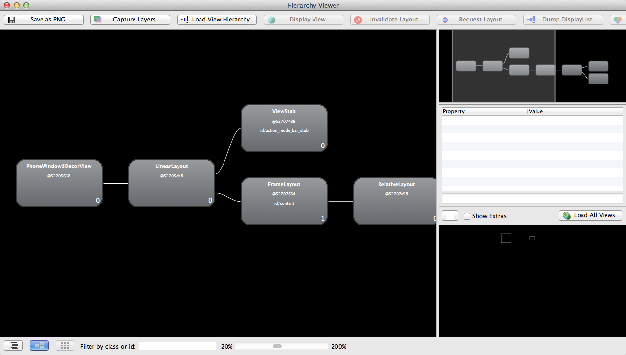
通过布局图我们可以看到根节点DecorView下包含一个LinearLayout, 这个LinearLayout就是包含Activity布局和状态栏的整个屏幕显示的布局父节点,这个LinearLayout有两个子节点, 一个是FrameLayout, FrameLayout就是Activity布局中默认的父布局节点, 这个节点下面就包含了我们自己写的xml布局, 还有一个子节点就是ViewStub,关于这个节点我们在后面会详细介绍。
< include />的使用
在实际开发中,我们经常会遇到一些共用的UI组件,比如带返回按钮的导航栏,如果为每一个xml文件都设置这部分布局,一是重复的工作量大,二是如果有变更,那么每一个xml文件都得修改。还好,Android为我们提供了include标签,顾名思义,通过它,我们可以将这些共用的组件抽取出来单独放到一个xml文件中,然后使用include标签导入共用布局,这样,前面提到的两个问题都解决了。下面以在一个布局main.xml中用include引入另一个布局header.xml为例。
header.xml文件
<xml version="1.0" encoding="utf-8">
<RelativeLayout xmlns:android="http://schemas.android.com/apk/res/android"
    android:layout_width="match_parent"
    android:layout_height="match_parent" >

    <Button
        android:id="@+id/button"
        android:layout_width="match_parent"
        android:layout_height="@dimen/dp_40"
        android:layout_above="@id/text"/>

    <TextView
        android:id="@+id/text"
        android:layout_width="match_parent"
        android:layout_height="@dimen/dp_40"
        android:layout_alignParentBottom="true"
        android:text="@string/app_name" />

</RelativeLayout>
然后我们在需要引入footer的布局xml中通过include导入这个共用布局。
main.xml文件
<FrameLayout xmlns:android="http://schemas.android.com/apk/res/android"
    android:layout_width="match_parent"
    android:layout_height="match_parent">

    <TextView
        android:layout_width="match_parent"
        android:layout_height="wrap_content"
        android:text="hello world" />

    <RelativeLayout
        android:layout_width="match_parent"
        android:layout_height="match_parent"
        android:layout_gravity="center" >

        <include layout="@layout/header" />

    </RelativeLayout>
</FrameLayout>
通过这种方式,我们既能提高UI的制作和复用效率,也能保证制作的UI布局更加规整和易维护。
< merge />的使用
merge标签的作用是合并UI布局,使用该标签能降低UI布局的嵌套层次。merge标签可用于两种典型情况:
-
布局根结点是FrameLayout且不需要设置background或padding等属性,可以用merge代替,因为Activity内容布局的parent view就是个FrameLayout,所以可以用merge消除只剩一个,这一点可以从上图中看到。
-
某布局作为子布局被其他布局include时,使用merge当作该布局的顶节点,这样在被引入时顶结点会自动被忽略,而将其子节点全部合并到主布局中。
以第一种情况为例,main.xml布局就可以优化如下:
<merge xmlns:android="http://schemas.android.com/apk/res/android"
    android:layout_width="match_parent"
    android:layout_height="match_parent">

    <FrameLayout
        android:layout_width="match_parent"
        android:layout_height="match_parent">

        <TextView
            android:layout_width="match_parent"
            android:layout_height="wrap_content"
            android:text="hello world" />

        <RelativeLayout
            android:layout_width="match_parent"
            android:layout_height="match_parent"
            android:layout_gravity="center" >

            <include layout="@layout/header" />

        </RelativeLayout>
    </FrameLayout>
</merge>
以第二种情况为例,header.xml布局可以优化如下:
<xml version="1.0" encoding="utf-8">
<merge xmlns:android="http://schemas.android.com/apk/res/android"
    android:layout_width="match_parent"
    android:layout_height="match_parent" >

    <Button
        android:id="@+id/button"
        android:layout_width="match_parent"
        android:layout_height="@dimen/dp_40"
        android:layout_above="@id/text"/>

    <TextView
        android:id="@+id/text"
        android:layout_width="match_parent"
        android:layout_height="@dimen/dp_40"
        android:layout_alignParentBottom="true"
        android:text="@string/app_name" />

</merge>
这样就不会有多余的FrameLayout和RelativeLayout节点了。
ViewStub标签
viewstub标签同include标签一样可以用来引入一个外部布局,不同的是,viewstub引入的布局默认不会扩张,即既不会占用显示也不会占用位置,从而在解析layout时节省cpu和内存。 viewstub常用来引入那些默认不会显示,只在特殊情况下显示的布局,如进度布局、网络失败显示的刷新布局、信息出错出现的提示布局等。
我们新建一个xml文件用来显示一个网络错误时提示信息error.xml:
<RelativeLayout xmlns:android="http://schemas.android.com/apk/res/android"
    xmlns:tools="http://schemas.android.com/tools"
    android:layout_width="wrap_content"
    android:layout_height="wrap_content" >

   <TextView
        android:layout_width="wrap_content"
        android:layout_height="wrap_content"
        android:layout_centerInParent="true"
        android:background="@android:color/white"
        android:padding="10dip"
        android:text="Message"
        android:textColor="@android:color/black" />

</RelativeLayout>
然后在main.xml里面加入ViewStub的标签引入上面的布局:
<merge xmlns:android="http://schemas.android.com/apk/res/android"
    xmlns:tools="http://schemas.android.com/tools"
    android:layout_width="match_parent"
    android:background="@android:color/darker_gray"
    android:layout_height="match_parent" >

    ...

    <ViewStub
        android:id="@+id/error_layout"
        android:layout_width="wrap_content"
        android:layout_height="wrap_content"
        android:layout_gravity="center"
        android:layout="@layout/error" />

</merge>
在java中通过(ViewStub)findViewById(id)找到ViewStub,通过stub.inflate()展开ViewStub,然后得到子View,如下:
private View errorView;

private void showError() {
    // not repeated infalte
    if (errorView != null) {
        errorView.setVisibility(View.VISIBLE);
        return;
    }

    ViewStub stub = (ViewStub)findViewById(R.id.error_layout);
    errorView = stub.inflate();
}

private void showContent() {
    if (errorView != null) {
        errorView.setVisibility(View.GONE);
    }
}
在上面showError()中展开了ViewStub,同时我们对errorView进行了保存,这样下次不用继续inflate。
总结
这篇Blog没有详细介绍HierarchyViewer工具的使用,相信如果对布局原则比较熟练之后,对工具的依赖大大减少,开发效率也会大大的提升。除这些布局原则之外,还需要大家对Android各个组件的属性很熟悉,比如如果要做这么一个布局, 一个图片和一个文本的布局,新手们往往会用一个Layout嵌套ImageView和TextView来做, 但是当我们知道TextView有drawableLeft, drawableRight等属性时,那么实现这样的一个布局是非常快速高效的。总之,且学且实践!
手机开发阅读排行
-

安卓开发复习笔记――Fragment+FragmentTabHost组件(实现新浪微
2016-09-26
-

2014年最新720多套Android源码2.0GB免费一次性打包下载
2016-01-01
-

开源直播系统源码功能一览表(含ios+android+服务端+后台)
2019-10-24
-
2019-09-26
-
2019-09-12
-
2019-09-24
-

直播源码的崛起的巅峰:布谷一对一视频直播的蓬勃发展让您见证了
2019-09-25
-
2019-09-23
最新文章
-

2022-03-16
-
2022-03-16
-
Android开发使用WebView打造webapp示例代码
2022-03-16
-

2022-03-16
-
开源直播系统源码功能一览表(含ios+android+服务端+后台)
2019-10-24
-
2019-10-22
-
2019-09-26
-
直播源码的崛起的巅峰:布谷一对一视频直播的蓬勃发展让您见证了
2019-09-25
热门源码